
UNITED NATIONS
PROJECT OVERVIEW
Client: The United Nations, an intergovernmental organization responsible for maintaining international peace and security, developing friendly relations among nations, achieving international cooperation, and being a center for harmonizing the actions of nations.
Task: To build a learning management system platform that provides quick resources, ongoing learning and live training to field staff.
Challenge: We did not have access to the intended users to survey, interview or test, and we were not provided with the specific content that the site would contain.
My role: User Researcher and UI Designer
Team: One other UX Designer
Duration: 2 weeks
I worked on a team of two UX designers tasked with creating a mid-fidelity prototype of a learning management system customized for the use of United Nations employees to view organization-specific educational based on market research and usability testing. We created the prototypes in Axure and presented them to our client, and he was very pleased with the results.
Read on to get the full story.
MY PROCESS

Phase 1: Market Research
We began by conducting a comprehensive comparative analysis of existing learning management system platforms, observing trends and best practices.
We conducted comparative analysis of many existing different learning management system platforms, including those pictured below.
Comparative Analysis
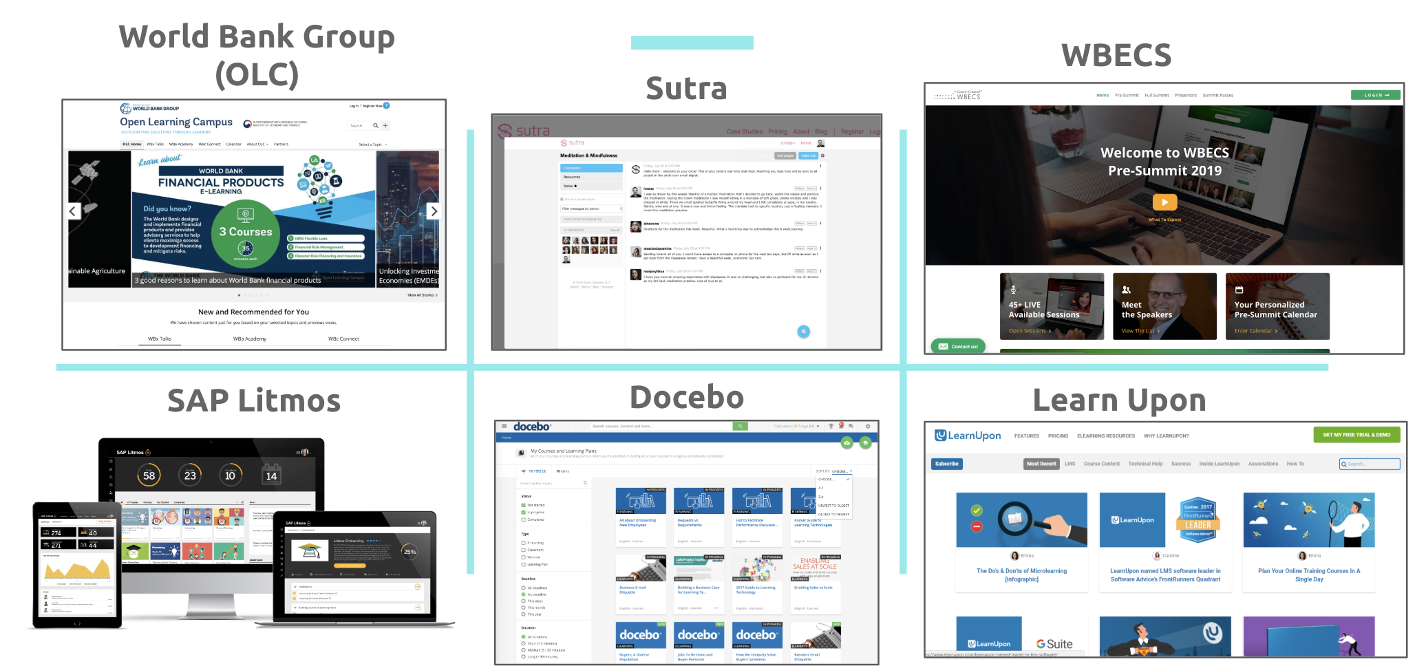
Key Takeaways From Our Comparative Analysis
We wanted to incorporate these features for optimal user accessibility and delight:
Clear use flows and information architecture
Cards/tiles for easy product scaling
Side navigation bar and top navigation bar
Easy to understand icons
Intuitive messaging feature
Phase 2: User Research
Next, we conducted user research in the form of card sorting. We also continuously conducted usability tests during our sketching and Axure prototyping process.
Card Sorting
We conducted open card sorts to see how users grouped the general topics that we had pulled from our client’s website. This was helpful in designing the information architecture, especially when we synthesized these results with the comparative analysis we conducted.

We recorded how our participants grouped the different topics we gave them, and we noticed common patterns. For example, our sorters tended to group cards that they thought were webinars together.
Phase 3: Information Architecture
Site Map
Based on the results of our comparative analysis and our card sort results, we created this site map for our LMS platform prototype. From the dashboard, we determined that all of these resource categories should all be at the same level in the site’s hierarchy, and then specific examples of each type of resource should be accessed through that general resource page.

Sketching
Once we had our sitemap, we began sketching, starting with the dashboard, then building out to the resource pages.

My initial sketches
These sketches incorporated the side navigation that we saw on many comparable websites, as well as the card design that will make for easier scaling.
Back to User Research!
Usability Testing
We asked our usability test participants where they would expect to go to find different functions and file types on our initial prototypes in Axure. We also asked them what they liked and if they found anything confusing.

Usability Test Feedback
The sidebar navigation initially expanded and got smaller — one tester said that that action did not improve the user experience
Users suggested we add buttons to allow users to go back up a level in navigation
We received multiple size and spacing suggestions from various users
Phase 4: User Interface
Web Design
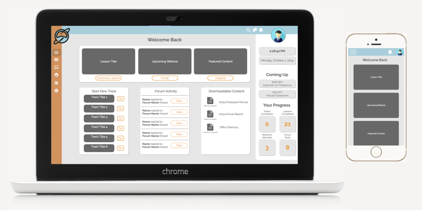
The dashboard of our prototype includes a banner with placeholders for continuing a lesson, viewing information on an upcoming webinar, and featured content, as seen below. Users can also continue a learning track they previously started, view recent forum activity, download global content, and view their upcoming events and overall progress. Our aim for the dashboard was to include quick actions taken by users on the platform pertaining to what they were already doing on the site, while still allowing for new content to be presented in an efficient way.

Other key pages include lesson pages, webinar pages, and the virtual classroom (one of which is shown below). We made sure to stay consistent with the design, and to not stray from current LMS conventions.

Mobile Design

Because many UN employees are on the move, in other countries, and in field offices, it was important to consider mobile design and how the site would be adaptable. The atomic design within the web prototype made transforming the content to fit mobile very doable.
Shown to the left is the dashboard page, adapted for mobile. We kept the most important aspects at the top of the page, created a pull-out menu, and moved messaging from the top bar to the menu.
Phase 5: Handoff
High Level Roadmap

I created this high-level road map for our client to provide guidelines for next steps; it was difficult to get too specific without knowing how they would be testing it with users and the development resources that would be allocated.
Results and Next Steps
What We Accomplished:
OUR CLIENT WAS HAPPY!
We delivered a platform that:
Allows for lessons and training to be built quickly
Has information architecture that provides for content to be organized by topic
Is based around learning tracks
Features a dashboard that recommends new or relevant training or materials
Contains training pages
Accommodates for documents, presentations, resources
Includes the ability to download media files
Has files and content associated with the topics
Is built for content to be found through the specific resource or found through search, which will be optimized by metadata
Features virtual webinar hosting
Contains a forum that can be used to share knowledge, ask questions and get answers on content and topics
Includes chat feature that can allow or facilitate training practice
And more!
Next Steps
Developers can follow the specifications we provided for the prototype, included in a Word spec sheet generated through Axure
Designers and developers need to build out platform features such as the search function, profile page, and settings page
The client and future designers will need to add content to the platform for testing with intended users
Top Takeaways
Even when you cannot speak to the specific intended user, it is valuable and worthwhile to talk to and test your product with other users.
It is beneficial to rely on design conventions and best practices for the best user experience — if people expect to see a magnifying glass as the search icon and bell for the notification icon, stick with those for a simple, easy-to-use design.