
MODERN TROUSSEAU

PROJECT OVERVIEW
Client: Modern Trousseau, a custom couture wedding dress store that makes wedding dresses customized and modified to fit every woman’s body.
Task: To restructure the site so that users can easily view photos of dresses and make the call to action to book an appointment clear to reduce bounces from the landing page.
Challenge: The current site had a confusing site structure, and did not convey clearly to site visitors that they could look at dresses and then book an in-person appointment.
My role: Communication Lead, User Researcher, Information Architect, UI Designer
Team: Four UX designers
Duration: 2 weeks
I worked on a UX Design team to redesign Modern Trousseau’s wedding dress website. We delivered high-fidelity mobile and desktop prototypes made in Figma with an accompanying style guide to facilitate ease of handoff to developers. Our client was thrilled with our work, as we utilized our design process to improve the usability of the site and optimize it for mobile use.
MY PROCESS

Phase 1: Market Research
We started by conducting market research, both on the wedding dress market in general and comparative analysis of retail wedding dress websites.
Wedding Dress Industry Market Research
As more customers embrace online alternatives, average gown prices are falling, and physical stores are struggling to adapt.
Renting a gown is now just as easy as buying — and less expensive.
Most wedding dresses are still sold in person — about 95%, according to online custom-wedding seller Anomalie.
The internet, including social media outlets such as Pinterest, has usurped other sources as the primary method of wedding planning.
About 92 percent of brides used smartphones to plan their wedding in 2017, up from 42 percent in 2014, according to TheKnot.com
Sources:
“Online Retailers Aim to Shake Up the Wedding Market.” The New York Times (Dec 2018).
“Buying wedding dresses online: More brides are leaving physical stores at the altar.” USA Today (Aug 2018).
This research emphasizes the importance of having an easy-to-use, welcoming online presence as well as the importance of having a site that is optimized for mobile use.
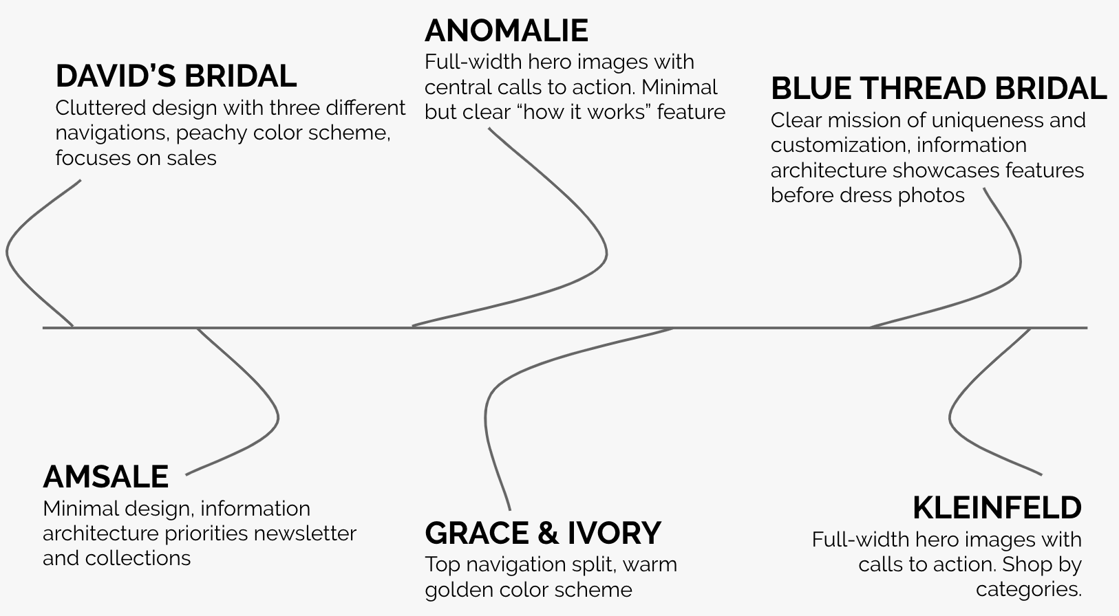
Comparative Analysis
We compared the websites of multiple competitors and their business models, including the following companies:
Comparative analysis graphic
Website Common Threads
Websites used wide banner images at the top of the home page.
The top navigation stays with you when you scroll down the page.
There are expanding hover links for the top navigation menu.
Websites featured customer reviews on the homepage.
Website Uncommon Threads
Color schemes varied. Some used multiple bright colors, some were black and white with the photos of the dresses serving as the pops of color.
The wording of the calls to action was not the same across all sites.
Pricing placement was different on different sites.
The use of iconography was not consistent throughout all sites (ex. search icon vs. the word Search).
Phase 2: User Research
Usability Testing
We conducted 10 usability tests of the current Modern Trousseau website (5 mobile and 5 desktop).
There were recurring themes in users’ comments about the current landing page. Here is what our testers reported:

Current Landing Page
Surveys
We created a brief survey and circulated it on social media, primarily Facebook.

Takeaways
Target participants: Brides who have already bought wedding dresses and are between the ages of 20–44+
26 women responded
Most of our participants were a younger audience, ages 20–31, with a budget of less than $1500.
They said that they researched wedding dresses online, primarily on their desktops.
They said they were mostly looking for less expensive dress options with the ability to try them on in-store.
They thought that custom dresses would have been expensive and time-consuming.
Next we dove into our user research, which included usability testing and surveys.
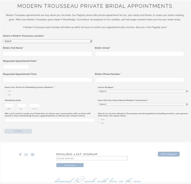
Book Appointment Page
Users said that questions on the appointment page made sense, but the form felt too long.
Our survey questions included questions about:
The age range they fit into
Their occupation
The year they got married
Their budget for the dress
Whether they wore a custom made wedding dress
Why did they wear (or not wear) a custom made wedding dress
How they researched dresses
What device they used to research dresses
The high points of the dress buying experience
The low points of the dress buying experience
Whether they had recommendations for women currently shopping for a wedding dress
Phase 3: Information Architecture
We synthesized the findings from our market and user research to define user types and design a new information architecture for the site. This involved individual and group sketching sessions.
This is the user flow that we developed based on what users said in usability tests for what they would expect the site to look like based on the business model of Modern Trousseau. This was in alignment with the client’s goal as well.

Once we had clear who uses this site from our market research and user expectations from user research, we began our sketching phase to solidify the site’s information architecture.
My Sketches
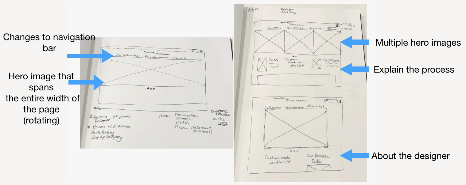
My initial sketches
I proposed changes to the main navigation bar to incorporate clearer information architecture and calls to action.
I sketched one version with a wide hero image which I observed during our comparative analysis. I indicated that this hero image would rotate between multiple photos to show a dress, the process of making the dress, and an example of a flagship store.
I also sketched another option that featured multiple hero images next to each other. My team ended up not going this route as we found that a single image at a time was more compelling.
I also experimented with putting the information about the designer on the left of the page next to information about the process and then switching the placement. We ended up not placing that information in columns next to each other because we ended up choosing to have the process explanation span the width of the page.
Group Sketching Sessions
Once my teammates and I had sketched our own designs in our notebooks, we came together and discussed which elements of each of our sketches we wanted to put into the final design. We had multiple whiteboarding sessions to synthesize the best elements of each design so that next we could start wireframing in Figma.

UX teammates during a group design session
Phase 4: User Interface Design
Since our research had revealed that the information architecture was previously unclear, we incorporated and tested our changes to the landing page, navigation elements, and the appointment booking flow.
Wire framing in Figma
After we decided which elements from our sketches fit best with our goals for the user experience, we started creating some low/mid fidelity prototypes in Figma for both the mobile and desktop experiences.
Here is a side-by-side comparison of some of the iterations we went through for mobile:

Prototyping in Figma
We started with lower fidelity prototypes in Figma and did usability tests to iterate element placement.
We then did A/B testing for colors, and a light blush color was the most popular choice.
We also inserted photos provided by the client and pulled from their current website and social media accounts.
We created both mobile and a desktop prototypes.
Here is the link to the high-fidelity mobile prototype that we created in Figma.
Here is the home page flow for the mobile prototype that we created.

Phase 5: Handoff
After we created high-fidelity prototypes, we handed the project off to our client’s chosen development team. I created a component library and style guide that the development team will work off of.
Handoff to developers:
Interactive Prototype on Figma with labeled components
We created a Style Guide within Figma
There is recommended CSS code within our Figma file
We provided best Figma handoff practices resources
We suggest further work between designers and developers to optimize loading speed of website
We recommend that accessibility be optimized in the buildout of the design, including alternate text for images
Results and Next Steps
What We Accomplished:
Assessed the usability of our client’s current website and prioritized areas for improvement
Focused on the first-time user experience and ensured that we are taking users on an emotional journey during their online experience
Showcased the product, got users to view the photos of the dresses, then guided them to book an appointment on the website
Optimized the user experience and website functionality for mobile use
Provided documentation of our designs to ensure a smooth handoff of our design files to developers
OUR CLIENT WAS THRILLED!
Next Steps I Recommend:
Continue usability testing with more women who are currently wedding dress shopping
Interview past Modern Trousseau customers — we were unable to do this due to our short project timeline
Build out the sitewide search function
Work on the About Us section
Continue iterating on design and copy to ensure search engine optimization
Key Takeaways
Ultimately, what was asked of me and my team was to match the client’s website experience to the already excellent in-person experience they provide — in other words, to convey the warmth and personal touch of the custom wedding dress experience through user interface design choices. I believe that we went a long way in making the website more welcoming, more intuitive, and easier to use.
What’s one big takeaway for me personally to share from this project? In addition to what I learned about the bridal dress industry, I learned through experience the utmost importance of developing a style guide and component library from the very beginning of each project, especially when collaborating on a team with other designers. It will save you lots of time!